NHS Choices, the previous magazine format for health information was characterised by confusing and difficult journeys, especially when accessing critical information on symptoms and conditions. The first step in transforming this required a deep focus on user needs, that resulted in new and radically simplifed approaches for delivering health information.
Solution
Introducing new research methods to understand user needs, combined with agile approaches to delivery, the Alpha and Beta began the transformation of the NHS's primary health information service. Moving the service away from information that ranged from wellness style content or overly complicated medical descriptions of symptoms.
NHS.UK is one of the largest health information site in the world, with around 75 million visitors every month. In an example of the Pareto principle, our data showed that 80% of all queries to NHS Choices (as it was known then), was concentrated on just 20% of the content.
With this focus, the goal of the Alpha team at NHS.UK, was to establish and scale user-centred approaches to the way government digital health services were developed. To develop a health information service, that was driven by needs of people accessing health information online. And susbsequently, transform the delivery of digital services across the whole of NHS Digital.
Action focused information
Many hours of research, in lab sessions with end-users, showed people often struggled to understand what steps they needed to take once they'd accessed health information online. Health content was predominantly written from a purely clinical perspective, not from a position of a lay-person struggling to understand a health issue. Subsequently, many users were often confused as to what to do next.
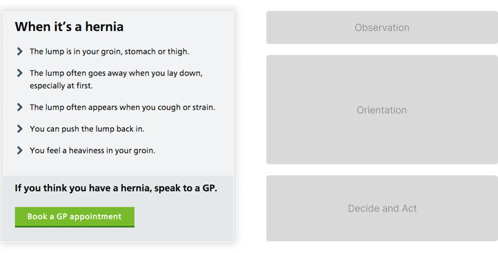
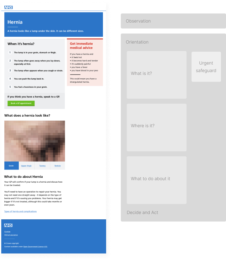
We changed the focus of the health information, in both a content and editorial structure, so that it aligned with the ways readers orientated themselves to the symptom or condition. Helping them make clear decisions by reflecting this information back into their own experience.

Content was re-written to be explicitly action-focused. Users could help orientate themselves with what they were experiencing, and had clear paths on what do odo next.
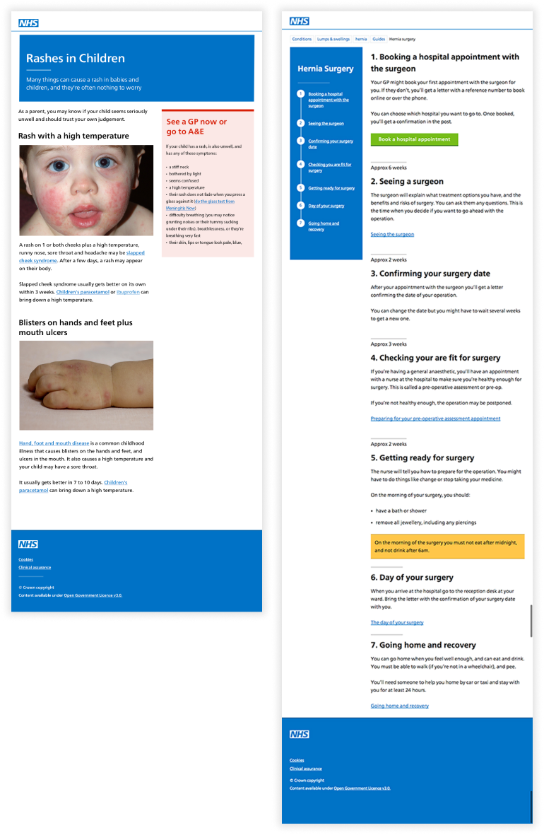
This operated on several levels.Not only did Interface components, reflect this new approach, but page architecture we reimagined to provide a consistent structure across all content, with clear pathways to care.

Together, this created a new experience for health content and this transformation was the start of the NHS.UK service, and was the first version of the NHS.UK design system.
